
The Top 5 Executive Dashboard Examples
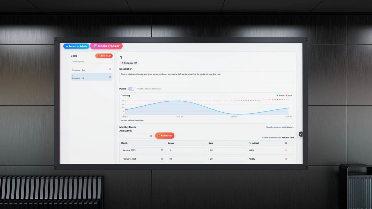
These five types of executive dashboards are the key to having the information needed to make decisions. Most executive dashboards are built backwards. Someone in IT or finance decides what data is available, exports it into a visualization tool, and calls it a dashboard. The executive receives a screen full of charts that looks impressive and tells them almost nothing useful.
A great executive dashboard works the other way around. It starts with the decisions the executive needs to make, identifies the data that informs those decisions, and presents that data in the clearest possible way. Nothing more, nothing less.
This article covers what executive dashboards actually are, what belongs in them, real examples across different business functions, and what separates the dashboards that drive decisions from the ones that just decorate a screen.
What Is an Executive Dashboard?
An executive dashboard is a single view that gives a senior leader the information they need to understand business performance and make decisions without digging through reports, asking their team for updates, or waiting for the monthly review.
The key word is single. A dashboard that requires scrolling through 14 tabs is not a dashboard. It is a report with a nicer interface. A true executive dashboard shows the most critical metrics for the business at a glance, updated in real time or close to it, with enough context to know whether what you are seeing is good, bad, or somewhere in between.
Great executive dashboards share three characteristics. They are focused, showing only what the executive needs to act on. They are current, reflecting data that is recent enough to be relevant. And they are contextual, showing performance against a target or benchmark rather than just a raw number floating in space.
Why Most Executive Dashboards Fail
Before looking at examples of what works, it is worth understanding why most dashboards do not.
The most common failure is too much data. When every department submits their metrics for inclusion, the dashboard becomes a political document rather than a decision-making tool. Every team wants their numbers represented. The result is a cluttered screen where nothing stands out and the executive has no idea where to focus.
The second failure is vanity metrics. Metrics that look good but do not connect to outcomes. Website visitors without conversion rate. Social media followers without engagement or revenue attribution. Gross revenue without margin. These numbers feel informative and are almost entirely useless for decision making.
The third failure is lag. A dashboard showing last quarter's numbers is a history lesson. By the time the executive sees the problem, they are already three months behind it. The best dashboards show data that is current enough to act on.
Executive Dashboard Example 1: CEO Dashboard
The CEO needs to see the health of the entire business in one view. Not the details of any single function but the signal from each one.
What It Tracks
Revenue vs Target: Current month and year to date revenue compared to plan. Not just the number but the gap and the trend.
Gross Margin: Are you making money on what you sell, and is that improving or eroding?
Cash Position and Runway: How much cash is in the bank and how many months does it cover at current burn rate.
Headcount vs Plan: Are you staffed to execute your strategy or running lean in areas that matter?
Customer Count and Churn Rate: Are you growing your customer base and keeping the ones you have?
Net Promoter Score: A single number that reflects how customers feel about the business overall.
Example in Practice
A SaaS company CEO opens their dashboard on Monday morning. Revenue is at 87% of monthly target with 8 days left in the month. Churn ticked up 0.3% from last month. Cash runway is 14 months. NPS dropped 4 points from last quarter. In 60 seconds the CEO knows exactly where to focus attention this week: the churn increase and the NPS drop are connected and need investigation before they compound.
Executive Dashboard Example 2: COO Dashboard
The COO needs operational visibility. Where are the bottlenecks, where is capacity strained, and where are processes breaking down?
What It Tracks
On-Time Delivery Rate: What percentage of commitments to customers are being met on schedule.
Operational Capacity Utilization: How much of the team's available capacity is being used versus sitting idle or overloaded.
Cycle Time for Key Processes: How long does it take to complete the most important recurring workflows, from customer onboarding to invoice processing.
Quality Metrics: Defect rate, error rate, or rework rate depending on the business type.
Headcount by Department vs Plan: Where are you overstaffed or understaffed relative to operational needs?
Cost Per Unit or Cost Per Transaction: Is the cost of delivering your product or service going up or down over time?
Example in Practice
The COO reviews their dashboard before the weekly leadership meeting. On-time delivery is at 91% against a 95% target. Cycle time for customer onboarding has crept up from 7 days to 11 days over the past six weeks. Cost per transaction is flat. They walk into the meeting knowing exactly which operational question needs to be answered today: what is slowing down onboarding and what does it cost us in churn risk?
Executive Dashboard Example 3: CFO Dashboard
The CFO dashboard is built around financial health, risk, and forecast accuracy. It answers the question: are we financially on track and what are the risks to that?
What It Tracks
Revenue and Gross Margin vs Budget: Actual versus planned at the top line and the margin line.
Operating Expenses vs Budget: Are departments spending within their approved budgets?
Cash Flow: Operating cash flow for the current period and the rolling 90-day forecast.
Accounts Receivable Aging: How much is owed to the business and how old is it? Aging receivables are a cash flow risk hiding in plain sight.
Forecast Accuracy: How close were last month's projections to actual results? A CFO who tracks this builds more credible forecasts over time.
Burn Rate and Runway: For growth-stage companies, how long does current cash last at the current rate of spend?
Example in Practice
The CFO dashboard shows revenue at 103% of budget, which looks great. But operating expenses are at 112% of budget, which explains why cash flow is tighter than expected despite strong revenue. Accounts receivable aging shows $180,000 in invoices over 60 days old, a number that has grown three months in a row. The CFO now has two clear priorities: get collections moving and find out where the overspend is concentrated.
Executive Dashboard Example 4: CMO Dashboard
The CMO dashboard connects marketing activity to business outcomes. It bridges the gap between marketing effort and revenue impact, which is where most marketing reporting falls apart.
What It Tracks
Pipeline Generated: Total value of sales opportunities marketing activity created this month and quarter.
Cost Per Lead by Channel: How much does it cost to acquire a lead from each marketing channel?
Lead to Opportunity Conversion Rate: What percentage of marketing leads become qualified sales opportunities?
Marketing Sourced Revenue: How much closed revenue can be attributed to marketing activity?
Campaign ROI: For each major campaign, what was the return on the spend?
Brand Search Volume: Is awareness growing? Are more people searching for the company by name over time?
Example in Practice
The CMO dashboard shows strong lead volume but a lead to opportunity conversion rate that has dropped from 22% to 14% over two months. Pipeline generated is down despite spending the same budget. The cost per lead looks fine in isolation but the quality of those leads has degraded. The CMO now has a specific conversation to have with the sales team: are the leads genuinely worse, or is something changing in how sales is qualifying them?
Executive Dashboard Example 5: Sales Leader Dashboard
The VP of Sales or Chief Revenue Officer needs to see pipeline health, team performance, and forecast reliability. The question they are always asking is: are we going to hit the number?
What It Tracks
Pipeline Value by Stage: How much opportunity is in each stage of the sales process and how does that compare to what you need to hit target?
Win Rate: What percentage of opportunities are being won, and is that trending up or down?
Average Deal Size: Is the team selling bigger or smaller deals than planned?
Sales Cycle Length: How long does it take from first contact to closed deal, and is that getting shorter or longer?
Quota Attainment by Rep: Who is performing, who is struggling, and who is borderline?
Forecast vs Actual: How accurate were last month's forecasts? Sales leaders who track this build more credible commitments to the CEO.
Example in Practice
The CRO dashboard shows total pipeline at 2.8 times the monthly target, which looks healthy. But 60% of that pipeline is in the earliest stage with less than two weeks left in the month. Win rate is down from 28% to 21% over the last quarter. Average deal size is up, which is masking the win rate problem in the revenue numbers. The CRO sees the real situation clearly: the team is chasing bigger deals, closing fewer of them, and the pipeline mix is not going to support the month-end forecast.
What Every Executive Dashboard Needs
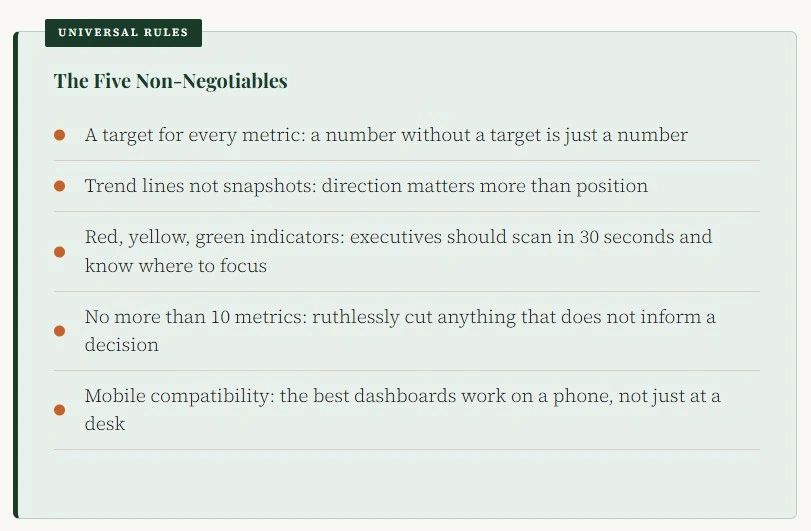
Regardless of role, every great executive dashboard shares the same structural principles.
The Best Tools for Building Executive Dashboards
You do not need enterprise software to build a great executive dashboard. The tools you already have are often enough.
Excel and Google Sheets are the most flexible and accessible options. For small and mid-size businesses, a well-built Excel dashboard with linked data sources, conditional formatting, and charts covers everything an executive needs. The learning curve is low if you know the right formulas and the maintenance cost is minimal.
Power BI is Microsoft's dedicated business intelligence tool. It connects to most data sources, updates automatically, and produces professional visualizations. It is the natural next step for businesses that have outgrown Excel dashboards.
Tableau is the gold standard for data visualization at scale. More powerful than Power BI for complex datasets and visualization needs, but also more expensive and more complex to set up and maintain.
Looker Studio (formerly Google Data Studio) is free, connects to Google's ecosystem natively, and produces clean dashboards that work well for marketing and operational data. A strong choice for businesses already using Google Analytics, Google Ads, and Google Sheets.

For most small and mid-size businesses, Excel or Google Sheets built well beats a poorly implemented enterprise tool every time.
Frequently Asked Questions
What is an executive dashboard?
An executive dashboard is a visual display of the most important metrics a senior leader needs to monitor business performance and make decisions. It presents data clearly, updates regularly, and is designed to give a complete picture of business health in a single view without requiring the executive to dig through multiple reports.
What should be on an executive dashboard?
An executive dashboard should include only the metrics that directly inform decisions the executive needs to make. For a CEO that typically means revenue, margin, cash position, headcount, customer count, and churn. For a COO it means operational metrics like on-time delivery, capacity utilization, and cycle times. The specific metrics depend on the role and the business, but the rule is the same: if a metric does not drive a decision, it does not belong on the dashboard.
How many metrics should an executive dashboard have?
No more than ten. Most great executive dashboards have six to eight core metrics. More than ten and the dashboard loses its ability to direct attention. The goal is not to show everything. The goal is to show the right things clearly enough that the executive immediately knows where to focus.
What is the difference between an executive dashboard and a report?
A report is historical. It tells you what happened. A dashboard is current. It tells you what is happening now and how it compares to what should be happening. Reports are useful for analysis and review. Dashboards are useful for real-time decision making and monitoring.
What tools are best for building executive dashboards?
Excel and Google Sheets work well for small and mid-size businesses. Power BI and Tableau are strong options for larger organizations with more complex data needs. Looker Studio is a good free option for businesses in the Google ecosystem. The best tool is the one your team will actually maintain and update consistently.
How often should an executive dashboard be updated?
Financial metrics should update at least monthly. Operational and sales metrics should update weekly. For fast-moving businesses, daily updates on key metrics like revenue, leads, and support volume are valuable. The rule is that data should be current enough to act on. A dashboard showing last quarter's numbers is a history lesson, not a management tool.
Can you build an executive dashboard in Excel?
Yes. Excel is one of the best tools available for building executive dashboards for small and mid-size businesses. With the right formulas, linked data sources, conditional formatting for red/yellow/green indicators, and charts, Excel produces professional, functional dashboards that give executives exactly what they need. Our Excel course covers how to build complete dashboard systems from scratch.
Executive dashboards are plug and play throughout Updoot, built for you, check it out free.